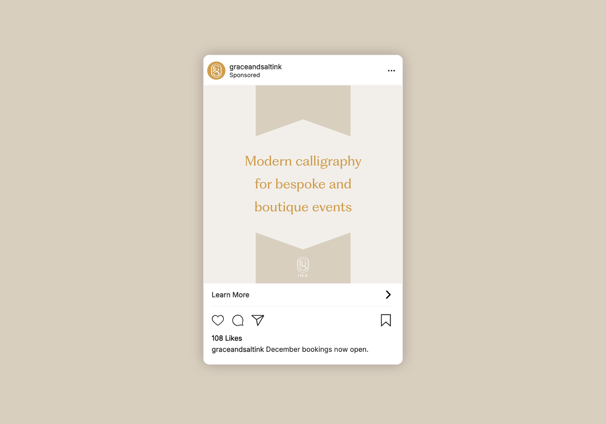
Grace & Salt Ink
Modern calligraphy, perfected by Rebecca M. Kemp. Bringing a personal touch to any special event. Weaving wonder into words, ensuring every project sings with timeless elegance.
We created a brand identity to match the bespoke beauty of Rebecca’s boutique event calligraphy. Complete with a delicious colour palette and supporting typography.

It was important to design a responsive visual identity system, to ensure the brand looked consistent in every orientation.
Effortless Elegance
The flow of Rebecca’s elegant calligraphy inspired the Grace and Salt Ink monogram, carefully combining the G and S initials with the ampersand.
In a crowded and competitive market, we needed to craft a colour palette that would help Grace & Salt Ink stand out—while also appealing to wedding and event planners.


